Spatial analysis of multiplex imaging data
Slide Deck
Overview
This module focuses on extracting spatial summary metrics from multiplex imaging data.
Load data and libraries.
library(tidyverse)
library(patchwork)

# load processed ovarian cancer data
load(url("https://github.com/julia-wrobel/MI_tutorial/raw/main/Data/ovarian.RDA"))
Visualize point patterns
Below we visualize a point pattern for a single subject from the ovarian cancer dataset.
- pink: stroma area
- light green: tumor area
- dark green: macrophages
- purple: B-cells
# subset to a single subject
subj_df = filter(ovarian_df, sample_id == 7)

# 7, 110, 34
# plot macrophage and B-cells
all = subj_df %>%
  ggplot(aes(x, y)) +
  geom_point(aes(color = tissue_category),
             size = 0.1, alpha = 0.7) +
  scale_color_manual(values = c("pink", "lightgreen")) +
  geom_point(data = filter(subj_df,  phenotype_cd68 == "CD68+"),
             color = "darkgreen", size = .5, shape = 4) +
    geom_point(data = filter(subj_df,  phenotype_cd19 == "CD19+"),
             color = "purple", size = .5, shape = 6) +
  theme(legend.position ="bottom")

cell_subset = subj_df %>%
  ggplot(aes(x, y)) +
  geom_point(data = filter(subj_df,  phenotype_cd68 == "CD68+"),
             color = "darkgreen", size = .5, shape = 4) +
    geom_point(data = filter(subj_df,  phenotype_cd19 == "CD19+"),
             color = "purple", size = .5, shape = 6) +
  theme(legend.position ="bottom")

all + cell_subset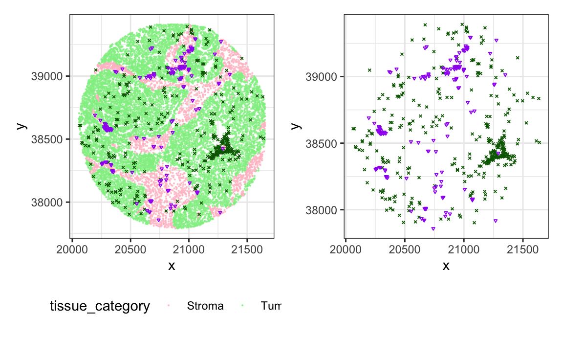
Analysis using spatstat package
The spatstat package in R has great
resources for analyzing spatial point patterns. Let’s use the image
above to do some exploratory analysis with spatstat.
We will do spatial analysis on the distribution of B-cells and
macrophages, so we subset to only these cell types, and create a
phenotype variable that designates whether a cell is a B
cell or a macrophage. Then we create a ppp object, which is
what the spatstat package uses for storage and analysis of
point pattern data.
library(spatstat)

subj_df = subj_df %>%
  # create a phenotype variable that is B-cell, macrophage, or other
  mutate(phenotype = case_when(
    phenotype_cd68 == "CD68+" ~ "macrophage",
    phenotype_cd19 == "CD19+" ~ "B-cell",
    TRUE ~ "other"
  )) %>%
  filter(phenotype != "other") %>%
  select(x,y, immune, tissue_category, phenotype)

# first define window of observation for your image
w = convexhull.xy(subj_df$x,subj_df$y)

# create ppp object as multitype point pattern
# need to factor the marks variable for ppp object to be treated as a multitype point pattern
ovarian_pp = ppp(subj_df$x,subj_df$y, window = w,
                 marks = factor(subj_df$phenotype))
Univariate Ripley’s K
First we calculate Ripley’s K for B cells.
k_bcell = Kest(subset(ovarian_pp, marks == "B-cell"), correction = "isotropic")We can plot this k_bcell object using
spatstat to visualize the estimated K (\(\hat{K}^{iso}\)) compared to the K under
CSR (\(K^{pois}\)).
plot(k_bcell)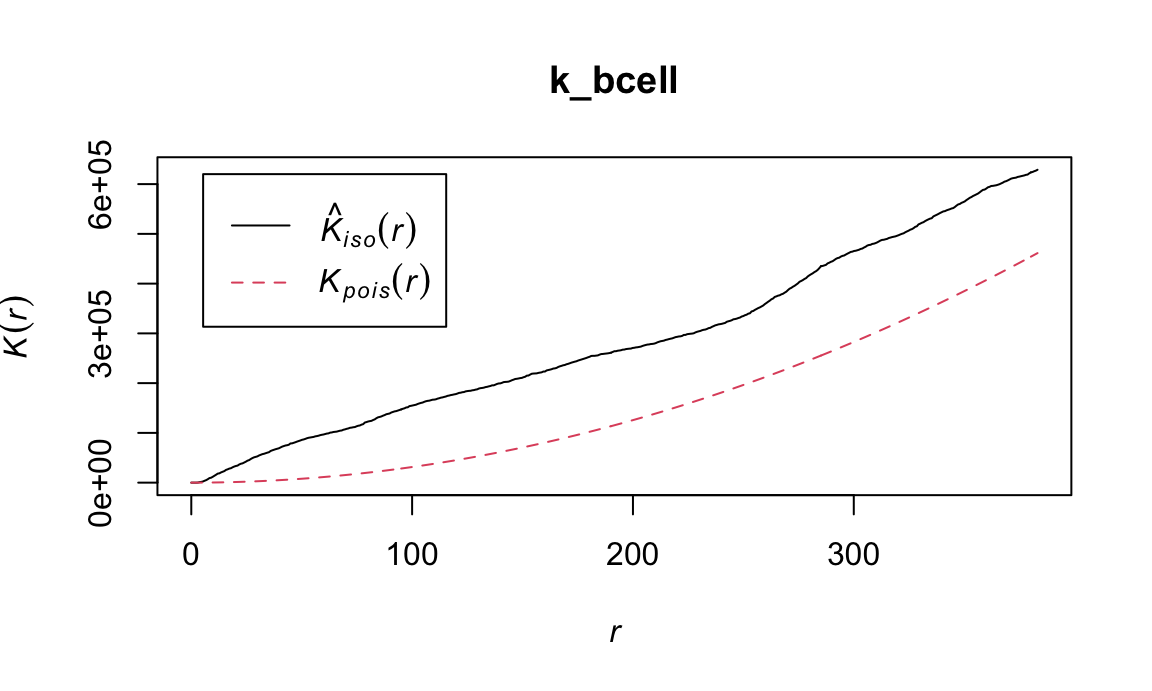
Now visualize the K-function for macrophages in this image:
k_mac =  Kest(subset(ovarian_pp, marks == "macrophage"),
              correction = "isotropic")
plot(k_mac)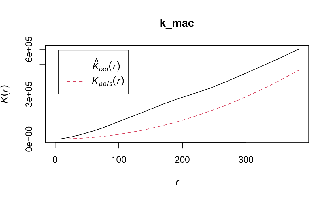
It appears that there is some degree of clustering for both B-cells and macrophages in this image. Are these statistically significant?
We can test this using the envelope function, which
performs Monte Carlo simulations of the K function under CSR. Plot below
shows pointwise envelope for B-cell K-function. Pointwise means that
these are performed separately for each value of r. Can only be
interpreted if a specific value of r is chosen in advance.
e_test = envelope(subset(ovarian_pp, marks == "B-cell"),
               Kest, correction = "isotropic")
## Generating 99 simulations of CSR  ...
## 1, 2, 3, 4, 5, 6, 7, 8, 9, 10, 11, 12, 13, 14, 15, 16, 17, 18, 19, 20, 21, 22, 23, 24, 25, 26, 27, 28, 29, 30, 31, 32, 33, 34, 35, 36, 37, 38, 39, 40,
## 41, 42, 43, 44, 45, 46, 47, 48, 49, 50, 51, 52, 53, 54, 55, 56, 57, 58, 59, 60, 61, 62, 63, 64, 65, 66, 67, 68, 69, 70, 71, 72, 73, 74, 75, 76, 77, 78, 79, 80,
## 81, 82, 83, 84, 85, 86, 87, 88, 89, 90, 91, 92, 93, 94, 95, 96, 97, 98,  99.
##
## Done.

plot(e_test)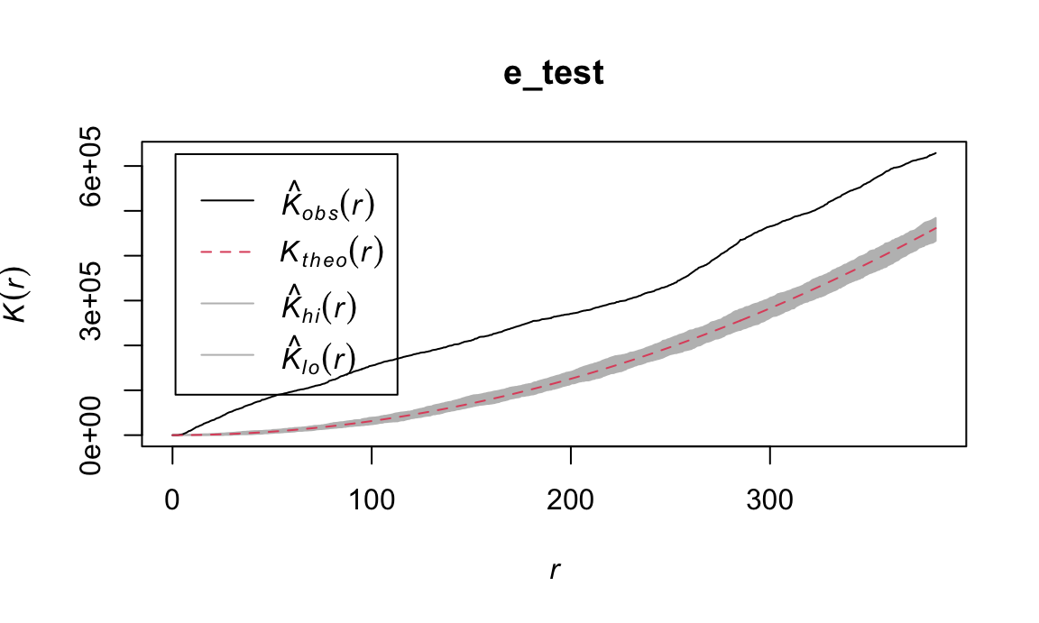
Points outside the envelope indicate significant departure from CSR.
Note that this could be due to inhomogeneity in the distribution of
cells, or due to clustering. See spatstat::Kinhom function
for a test that takes into account inhomogeneity. See
spatstat::Lest function to compute the L-function.
Bivariate Ripley’s K
The bivariate K function measures whether the spatial distribution of 2 cell types is independent. Deviation from the \(K^{pois}\) line suggests a spatial relationship between the B-cells and macrophages in the image.
k_biv = Kcross(ovarian_pp, "B-cell", "macrophage", correction = "isotropic")

plot(k_biv)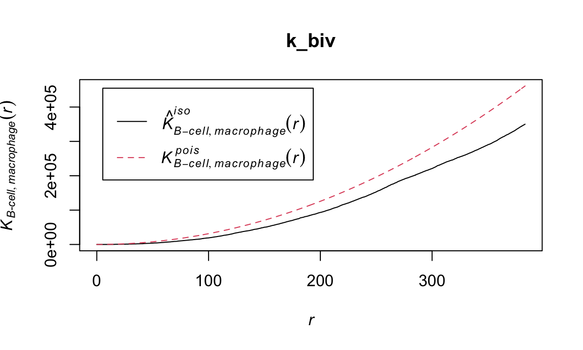
Nearest neighbor G function
Can interpret as probability of a neighboring cell occurring within radius r.
G_bcell = Gest(subset(ovarian_pp, marks == "B-cell"), correction = "rs")

plot(G_bcell)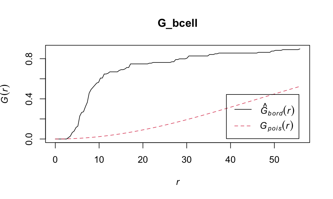
Its bivariate counterpart
G_biv = Gcross(ovarian_pp, correction = "rs")

plot(G_biv)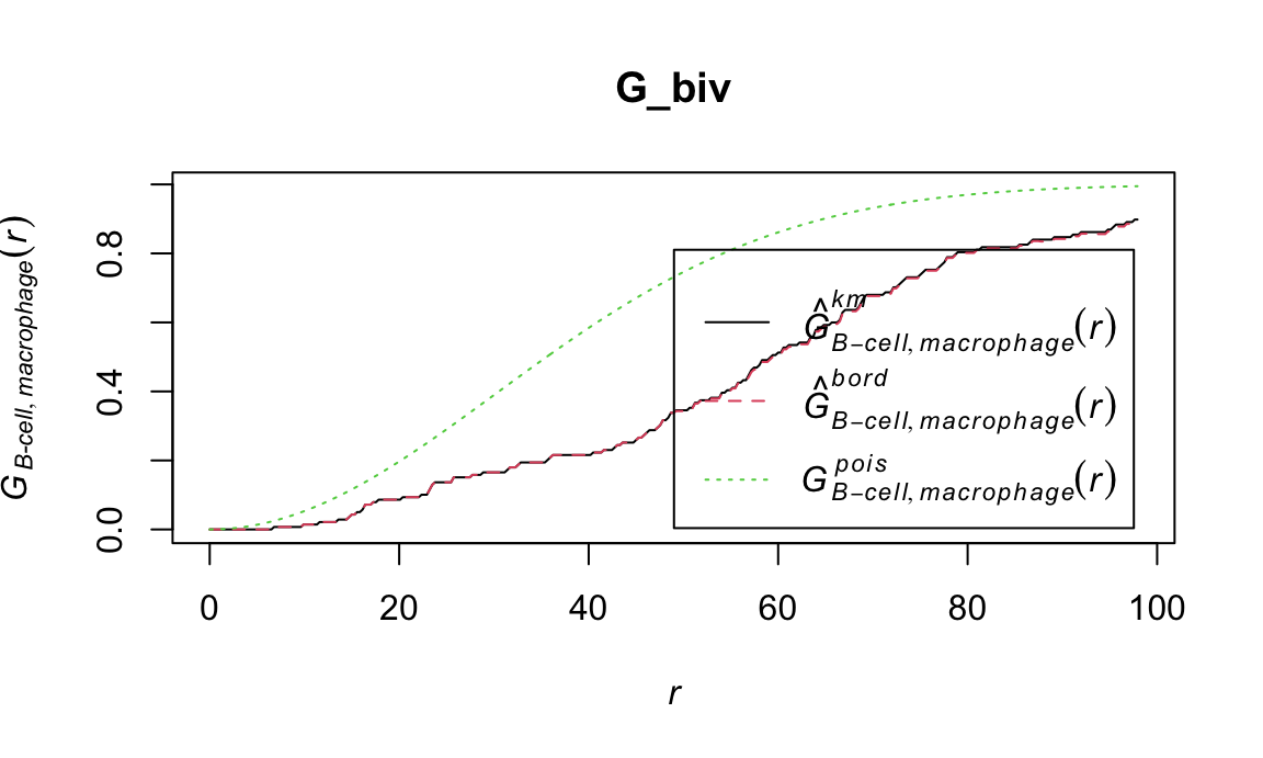
SpatialTIME package
Organize data for use in the spatialTIME package.
library(spatialTIME)

# subsetting to 2 subjects for faster computation and ease of visualization
ids = c( 7, 128)

spatial_ls = filter(ovarian_df, sample_id %in% ids) %>%
    mutate(XMax = x, XMin = x,
         YMax = y, YMin = y,
         sample_id = factor(sample_id),
         id = sample_id,
         cd19 = ifelse(phenotype_cd19 == "CD19+", 1, 0),
         cd3 = ifelse(phenotype_cd3 == "CD3+", 1, 0),
         cd8 = ifelse(phenotype_cd8 == "CD8+", 1, 0),
         cd68 = ifelse(phenotype_cd68 == "CD68+", 1, 0)) %>%
  dplyr::select(sample_id, id, XMax, XMin, YMax, YMin,
                cd19, cd3, cd8, cd68, tissue_category) %>%
  nest_by(id)

# define clinical data
clinical_data = ovarian_df %>%
  dplyr::select(sample_id, survival_time, death, stage_bin, BRCA_mutation) %>%
  distinct() %>%
  mutate(id = sample_id)

sample_data = ovarian_df %>%
  group_by(sample_id) %>%
  summarize(total_cells = n()) %>%
  ungroup() %>%
  mutate(id = sample_id)


df_spatialTIME = spatialTIME::create_mif(
  clinical_data = clinical_data,
  sample_data = sample_data,
  spatial_list = spatial_ls$data,
  patient_id = "id",
  sample_id = "sample_id"
           )

rm(spatial_ls)
Plotting samples
cell_types = c("cd68", "cd19")
values =  RColorBrewer::brewer.pal(length(cell_types), "Accent")


#add an element in the `derived` object position
df_spatialTIME <- plot_immunoflo(df_spatialTIME,
                   plot_title = "sample_id",  mnames = cell_types,
                   cell_type = "tissue_category")
Calculate spatial summary metrics (calculating univariate K function across samples and phenotypes).
df_spatialTIME <- ripleys_k(mif = df_spatialTIME,
                            mnames = cell_types,
                            method = "K",
                            r_range = seq(0, 300, 10),
                            edge_correction = 'translation'
                            #permute = TRUE,
                            #num_permutations = 100
                            )
Plot images(top row) and K functions (bottom row).
k_funs = df_spatialTIME$derived$univariate_Count  %>%
  janitor::clean_names() %>%
  ggplot(aes(x = r, y = observed_k)) +
  geom_line(aes(group = marker,
             color = marker)) +
  geom_line(aes(r, theoretical_csr), linetype = 2) +
  facet_wrap(~sample_id, scales = 'free', nrow = 1) + theme_bw() +
  theme(legend.position = "bottom") +
  scale_color_manual(values = values)


imgs = patchwork::wrap_plots(df_spatialTIME$derived$spatial_plots, nrow = 1)

imgs / k_funs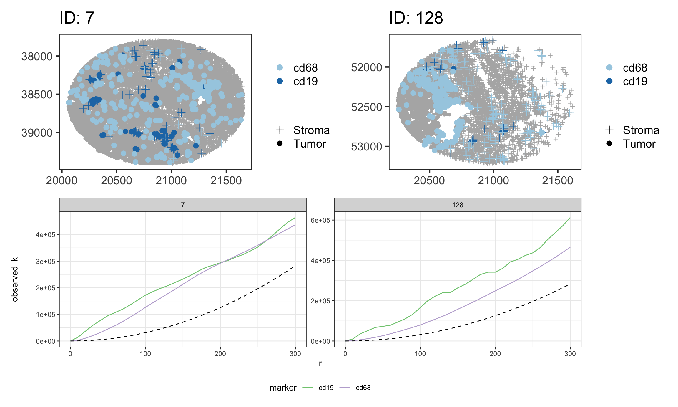
Also allows for calculation of bivariate K, univariate and bivariate L, G, with and without permutations.