Modeling patient-level outcomes
Slide Deck
Overview
This module focuses on modeling patient-level outcomes, specifically patient survival time, using spatial summary statistics derived from multiplex images as model covariates. First we use traditional regression models and single-number patient summaries. Then, we model entire spatial summary functions using methods from functional data analysis.
Load data and libraries.
library(tidyverse)
library(patchwork)
library(spatstat)
library(survival)
library(refund)
library(refund.shiny)

# load processed ovarian cancer data from GitHub
load(url("https://github.com/julia-wrobel/MI_tutorial/raw/main/Data/ovarian.RDA"))
Regression with patient level outcomes
The general workflow is:
- Select a spatial summary measure (e.g. bivariate Ripley’s K).
- Choose a particular radius r at which to evaluate Ripley’s K. This can be selected based on clinical knowledge.
- Choose a cell spatial relationship you want to analyze (e.g. co-occurence of B-cells and macrophages).
- Evaluate bivariate Ripley’s K for B-cells and Macrophages at radius r for all images in the dataset. This will result in a single number spatial summary for each image.
- Select a patient-level outcome of interest (e.g. survival)
- Model the outcome, using and the spatial summary statistic as a covariate. Include other potential confounders.
Ovarian immune cell clustering and patient survival
Let’s say I am interested in the relationship between patient survival and the clustering of immune cells within the tumor areas in the ovarian cancer dataset.
For this analysis I will collapse immune cell subtypes (B-cell, macrophage, CD8 T cell) into one “immune cell” category. I will then calculate univariate L at radius r = 100 for immune cells. It would also be reasonable to use the K or G function.
Calculating the spatial summary statistics
First I define a function that can be used to extract the L-function at a particular radius or set of radii.
# function to extract univariate spatial summary statistics
# replace argument func = Lest with func = Kest to get K function estimates
# returns a data frame with estimate L values and L under CSR and different radii
extract_univariate = function(data, x = "x", y = "y",
                      subject_id = "sample_id",
                      marksvar,
                      mark1 = "immune",
                      r_vec = seq(0, 300, by = 10),
                      func = Lest){
  # create a convex hull as the observation window
  w = convexhull.xy(data[[x]], data[[y]])

  # create ppp object
  pp_obj = ppp(data[[x]], data[[y]], window = w, marks = data[[marksvar]])

  # estimate L using spatstat
  L_spatstat = func(subset(pp_obj, marks == mark1),
                    r = r_vec,
                    correction = c("iso")
  )

  df = as_tibble(L_spatstat) %>%
    select(r, L = iso, csr = theo) %>%
    mutate(Ldiff = L - csr,
           subject_id = data[[subject_id]][1]) %>%
    select(subject_id, r, L, csr, Ldiff)

  df

}
Then I organize the data and apply this function to all images in the dataset.
df_nest = ovarian_df %>%
  # subset to tumor areas
  filter(tissue_category == "Tumor") %>%
  mutate(id = sample_id) %>%
  dplyr::select(sample_id, x, y, immune, id) %>%
  nest(data = c(sample_id, x, y, immune))

L_df = map_dfr(df_nest$data, extract_univariate,
               marksvar = "immune", mark1 = "immune",
               r_vec = c(0, 50, 100))
## Warning: data contain duplicated points
## Warning: 1 point was rejected as lying outside the specified window
## Warning: data contain duplicated points
## Warning: 1 point was rejected as lying outside the specified window

L_df
## # A tibble: 384 × 5
##    subject_id     r     L   csr Ldiff
##         <dbl> <dbl> <dbl> <dbl> <dbl>
##  1         68     0   0       0   0
##  2         68    50  83.5    50  33.5
##  3         68   100 138.    100  37.6
##  4         69     0   0       0   0
##  5         69    50 114.     50  64.1
##  6         69   100 176.    100  76.1
##  7         70     0   0       0   0
##  8         70    50  62.9    50  12.9
##  9         70   100 115.    100  15.4
## 10         71     0   0       0   0
## # ℹ 374 more rows
We want to use the Ldiff variable, which is the
difference between the observed L and the theoretical L under CSR, in
our model. This value will be positive if cells are clustered in an
image, negative if cells show spatial regularity, and close to zer0 if
cells exhibit CSR. We will select the Ldiff value at r
= 100. I visualize this variable below.
L_df = L_df %>%
  filter(r == 100) %>%
  select(subject_id, Ldiff)

L_df %>%
  ggplot(aes(Ldiff)) +
  geom_histogram() +
geom_vline(xintercept = 0) 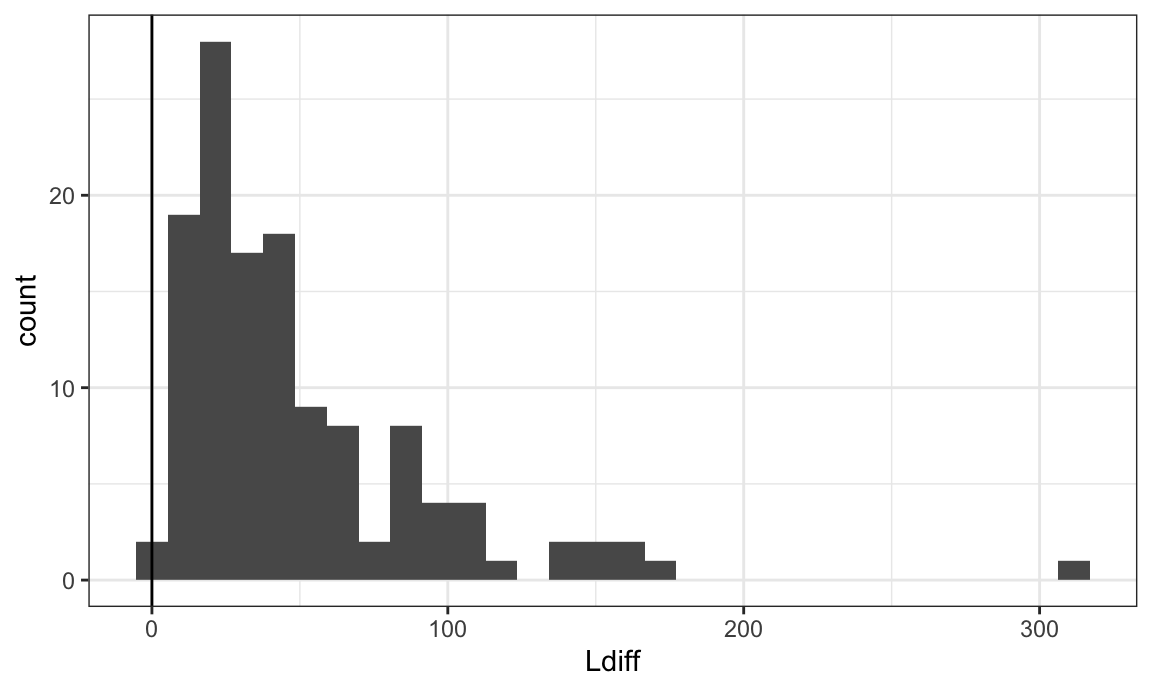
Let’s examine the subject with the outlying Ldiff value. It appears that they have very few immune cells, so the Ldiff cannot be well estimated. We will remove this subject.
id = L_df %>% filter(Ldiff > 200)  %>% pull(subject_id)

ovarian_df %>%
  filter(sample_id %in% id,
         tissue_category == "Tumor") %>%
  ggplot(aes(x, y, color = immune)) +
  geom_point(size = .1)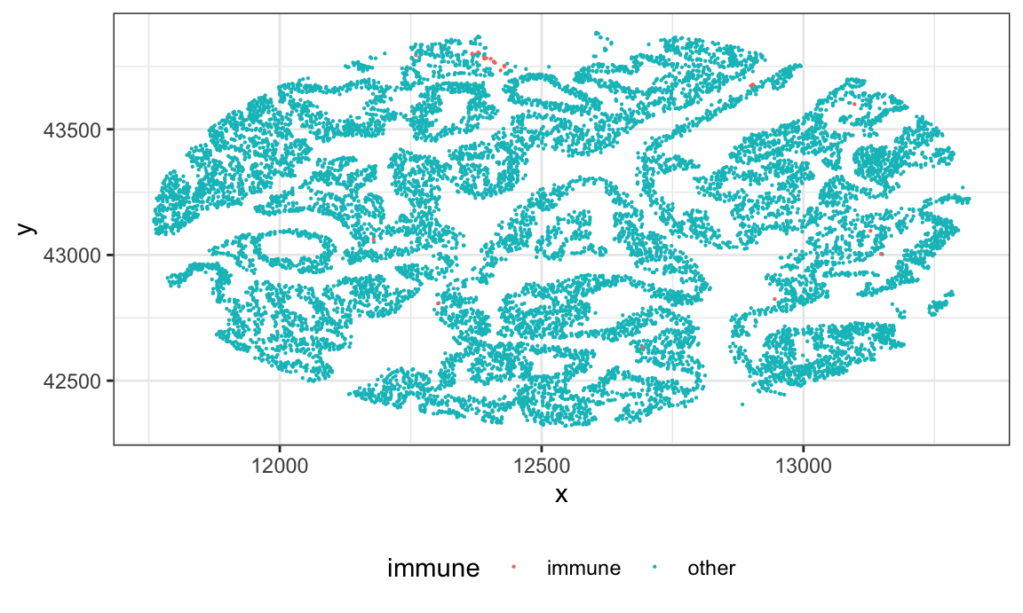
# remove this subject
L_df = L_df %>% filter(Ldiff <=200)
Modeling patient survival
First I merge the patient level outcome data with the L summary statistics.
survival_df = ovarian_df %>%
  # rename id variable to be compatible with L_df and select covariates of interest
  dplyr::select(subject_id = sample_id,
                survival_time, death, age = age_at_diagnosis) %>%
  # delete duplicates- should only have one row per subject
  distinct() %>%
  # remove subject with outlying survival time
  filter(survival_time < 200) %>%
  # merge with L function data
  left_join(., L_df, by = "subject_id")
Below I plot the survival time against Ldiff values, colored by survival status. It does appear that lower values of Ldiff (indicating less extreme immune clustering) have longer survival times.
survival_df %>%
  ggplot(aes(Ldiff, survival_time)) +
  geom_point(aes(color = factor(death)))
## Warning: Removed 1 rows containing missing values (`geom_point()`).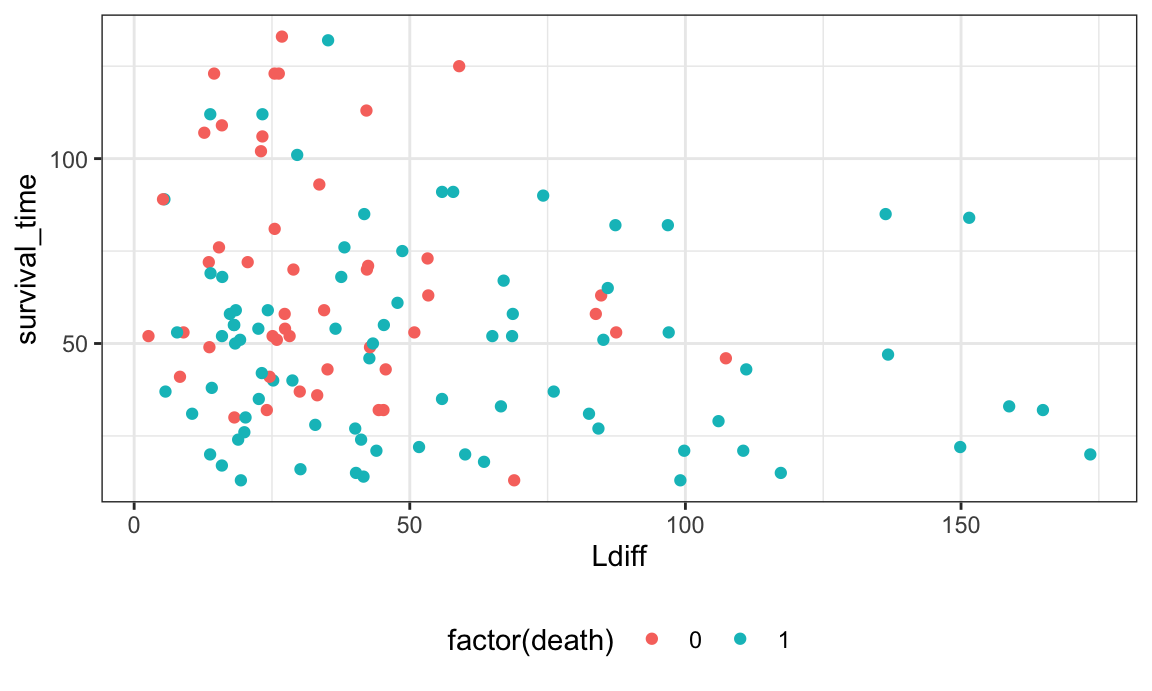
Last we run a proportional hazards model to model this different. We
will run this model using functions from the survival
package.
phmod = coxph(Surv(survival_time, death) ~ Ldiff + age,
              data = survival_df)
summary(phmod)
## Call:
## coxph(formula = Surv(survival_time, death) ~ Ldiff + age, data = survival_df)
##
##   n= 126, number of events= 79
##    (1 observation deleted due to missingness)
##
##           coef exp(coef) se(coef)     z Pr(>|z|)
## Ldiff 0.009221  1.009263 0.002911 3.168  0.00153 **
## age   0.014171  1.014272 0.011298 1.254  0.20974
## ---
## Signif. codes:  0 '***' 0.001 '**' 0.01 '*' 0.05 '.' 0.1 ' ' 1
##
##       exp(coef) exp(-coef) lower .95 upper .95
## Ldiff     1.009     0.9908    1.0035     1.015
## age       1.014     0.9859    0.9921     1.037
##
## Concordance= 0.621  (se = 0.034 )
## Likelihood ratio test= 13.5  on 2 df,   p=0.001
## Wald test            = 14.9  on 2 df,   p=6e-04
## Score (logrank) test = 15.6  on 2 df,   p=4e-04
Here the coefficients are log-hazard ratios. The exponentiated
coefficient for Ldiff > 1, indicating that the hazard of
death is greater for a subject with a greater degree of immune
clustering.
Some caveats about this analysis:
- We cannot distinguish clustering from inhomogeneity, so we may want
to consider calculating L using a metric that takes into account
potential inhomogeneity in the distribution of cells. This could be the
spatstat::Linhom()function, or using the permutation approach inspatialTIME. - It is important to check validity of model assumptions, which we have not done here
- In a more thorough analysis I would control for other clinical variables that may be potential confounders.
Macrophage and B-cell co-occurence in ovarian cancer
Here I am interested in the relationship between patient survival and the co-occurence of B cells and macrophages in the ovarian cancer dataset. I will use bivariate L at radius r = 100 to assess the spatial relationship between B-cells and macrophages.
Calculating the spatial summary statistics
First I define a function that can be used to extract the bivariate L-function at a particular radius or set of radii.
# function to extract univariate spatial summary statistics
extract_bivariate = function(data, x = "x", y = "y",
                             subject_id = "sample_id",
                             marksvar,
                             mark1 = "B-cell",
                             mark2 = "macrophage",
                             r_vec = seq(0, 300, by = 10)){
  # create a convex hull as the observation window
  w = convexhull.xy(data[[x]], data[[y]])

  # create ppp object
  pp_obj = ppp(data[[x]], data[[y]], window = w, marks = data[[marksvar]])

  # estimate L using spatstat
  L_spatstat = Lcross(pp_obj, mark1, mark2, r = r_vec, correction = "iso")

  df = as_tibble(L_spatstat) %>%
    select(r, L = iso, csr = theo) %>%
    mutate(Ldiff = L - csr,
           subject_id = data[[subject_id]][1]) %>%
    select(subject_id, r, L, csr, Ldiff)

  df
}
Then I organize the data to apply this function. However, some subjects do not have enough B-cells or macrophages to calculate the L function. We will exclude subjects with < 3 macrophages or < 3 B-cells in the tumor area. In doing so, we lose several subjects.
df_bivariate = ovarian_df %>%
  filter(tissue_category == "Tumor") %>%
  # subset to tumor areas
  filter(tissue_category == "Tumor") %>%
  # define B cell or macrophage variable
  mutate(id = sample_id,
         phenotype = case_when(phenotype_cd19 == "CD19+" ~ "B-cell",
                               phenotype_cd68 == "CD68+" ~ "macrophage",
                               TRUE ~ "other"),
         phenotype = factor(phenotype)) %>%
  filter(phenotype != "other") %>%
  dplyr::select(sample_id, x, y, phenotype, id) %>%
  # calculate number of macrophages and B-cells for each subject
  group_by(sample_id)  %>%
  mutate(n_Bcell = sum(phenotype == "B-cell"),
         n_mac = sum(phenotype == "macrophage")) %>%
  ungroup() %>%
  filter(n_Bcell > 2, n_mac > 2) %>%
  # nest data
  nest(data = c(sample_id, x, y, phenotype))
Lbivariate_df = map_dfr(df_bivariate$data, extract_bivariate,
marksvar = "phenotype",
r_vec = c(0, 50, 100))
Lbivariate_df
## # A tibble: 198 × 5
## subject_id r L csr Ldiff
## <dbl> <dbl> <dbl> <dbl> <dbl>
## 1 68 0 0 0 0
## 2 68 50 64.3 50 14.3
## 3 68 100 99.3 100 -0.730
## 4 69 0 0 0 0
## 5 69 50 57.6 50 7.61
## 6 69 100 141. 100 41.1
## 7 70 0 0 0 0
## 8 70 50 49.4 50 -0.565
## 9 70 100 140. 100 39.8
## 10 72 0 0 0 0
## # ℹ 188 more rowsHistogram of the bivariate Ldiff variable:
Lbivariate_df = Lbivariate_df %>%
  filter(r == 100) %>%
  select(subject_id, Ldiff)

Lbivariate_df %>%
  ggplot(aes(Ldiff)) +
  geom_histogram() +
geom_vline(xintercept = 0) 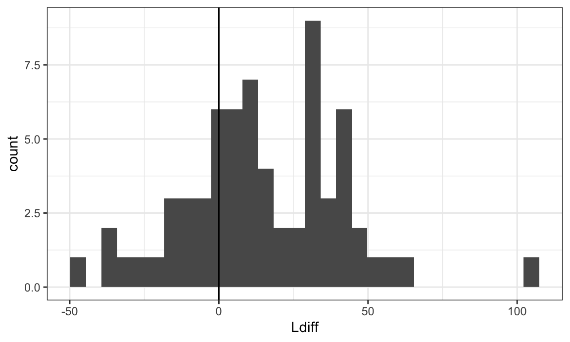
Modeling patient survival
First I merge the patient level outcome data with the L summary statistics.
survival_df = ovarian_df %>%
  # rename id variable to be compatible with L_df and select covariates of interest
  dplyr::select(subject_id = sample_id,
                survival_time, death, age = age_at_diagnosis) %>%
  # delete duplicates- should only have one row per subject
  distinct() %>%
  # remove subject with outlying survival time
  filter(survival_time < 200) %>%
  # merge with L function data
  left_join(., Lbivariate_df, by = "subject_id")
Now it appears that larger L values (more clustering between B cells and macrophages) is associated with better survival prognosis.
survival_df %>%
  ggplot(aes(Ldiff, survival_time)) +
  geom_point(aes(color = factor(death)))
## Warning: Removed 61 rows containing missing values (`geom_point()`).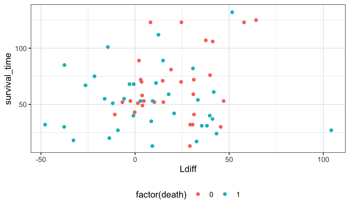
Run the proportional hazards regression model with bivariate L as a covariate.
phmod2 = coxph(Surv(survival_time, death) ~ Ldiff + age,
              data = survival_df)
summary(phmod2)
## Call:
## coxph(formula = Surv(survival_time, death) ~ Ldiff + age, data = survival_df)
##
##   n= 66, number of events= 35
##    (61 observations deleted due to missingness)
##
##            coef exp(coef)  se(coef)      z Pr(>|z|)
## Ldiff -0.014583  0.985522  0.006935 -2.103   0.0355 *
## age    0.012650  1.012730  0.015464  0.818   0.4133
## ---
## Signif. codes:  0 '***' 0.001 '**' 0.01 '*' 0.05 '.' 0.1 ' ' 1
##
##       exp(coef) exp(-coef) lower .95 upper .95
## Ldiff    0.9855     1.0147    0.9722     0.999
## age      1.0127     0.9874    0.9825     1.044
##
## Concordance= 0.567  (se = 0.063 )
## Likelihood ratio test= 5.28  on 2 df,   p=0.07
## Wald test            = 5.35  on 2 df,   p=0.07
## Score (logrank) test = 5.39  on 2 df,   p=0.07
Now the exponentiated coefficient for Ldiff < 1,
indicating that the hazard of death is smaller for a subject with a
greater degree co-occurence between B-cells and macrophages.
Some caveats about this analysis:
- We removed a lot of subjects (61) because we didn’t have enough
subjects to calculate the bivariate L function. I would recommend
either:
- Creating a categorical L variable that includes a “not estimable” group so as to not lose these subjects
- Or, using something like the G function which is more robust to rare cells and fewer subjects would be lost.
Functional data analysis
Functional data analysis allows you to leverage information from the full spatial summary function (e.g. K-function) rather than picking a specific radius r, which can be an arbitrary choice.
The general workflow is:
- Select a spatial summary function (e.g. bivariate Ripley’s K).
- Evaluate spatial summary function for the cell(s) of choice over a range of biologically meaningful radii. This will result in one spatial summary function for each image.
- Visualize the functions
- Select a patient-level outcome of interest (e.g. survival)
- Choose a functional data model (functional principal components analysis or functional regression)
I will use the ovarian immune cell clustering analysis above as a starting point, and use a functional principal components analysis approach. Resources for functional regression are provided in the “references” section below. Here I am interested in the relationship between patient survival and the clustering of immune cells within the tumor areas in the ovarian cancer dataset. I will calculate a univariate L function for immune cells.
Estimating the spatial summary functions
I can use the same extract_univariate function I defined
above to compute the L function at several radii across subjects. This
is performed below:
df_nest = ovarian_df %>%
  # subset to tumor areas
  filter(tissue_category == "Tumor") %>%
  mutate(id = sample_id) %>%
  dplyr::select(sample_id, x, y, immune, id) %>%
  nest(data = c(sample_id, x, y, immune))

# we are evaluating L at 100 different radii, so this will take some time to compute
L_fda_df = map_dfr(df_nest$data, extract_univariate,
               marksvar = "immune", mark1 = "immune",
               r_vec = seq(0, 200, length.out = 100))
## Warning: data contain duplicated points
## Warning: 1 point was rejected as lying outside the specified window
## Warning: data contain duplicated points
## Warning: 1 point was rejected as lying outside the specified window

head(L_fda_df)
## # A tibble: 6 × 5
##   subject_id     r     L   csr Ldiff
##        <dbl> <dbl> <dbl> <dbl> <dbl>
## 1         68  0      0    0     0
## 2         68  2.02   0    2.02 -2.02
## 3         68  4.04  19.3  4.04 15.2
## 4         68  6.06  24.7  6.06 18.6
## 5         68  8.08  31.3  8.08 23.2
## 6         68 10.1   35.4 10.1  25.3
Let’s visualize the L functions across subjects using a spaghetti plot.
Lp = L_fda_df %>%
  ggplot(aes(r, L, group = subject_id)) +
  geom_line(alpha = 0.4) +
  geom_line(data = filter(L_fda_df, subject_id == 68), aes(y = csr), color = "red3",
            linetype = 2) +
  ggtitle("L(r)")


Lp2 = L_fda_df %>%
  ggplot(aes(r, Ldiff, group = subject_id)) +
  geom_line(alpha = 0.4) +
  geom_hline(yintercept = 0, color = "red3", linetype = 2) +
  ggtitle("L(r)-r")

Lp + Lp2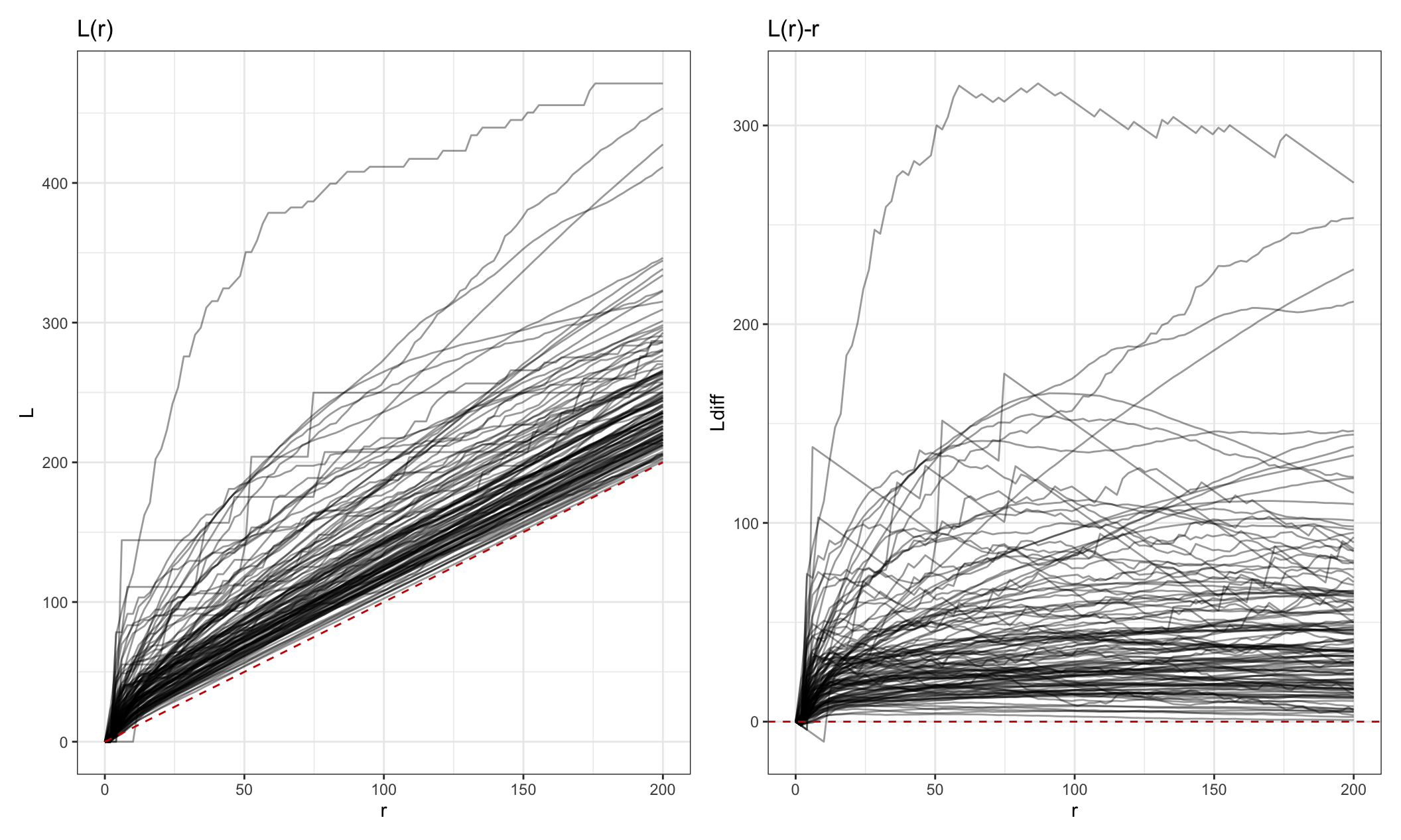
Functional principal components analysis
FPCA can be performed for dimension reduction, then functional
principal component scores can be used as covariates in a traditional
regression model. I run fpca using the fpca.face() function
from the refund package.
# convert Ldiff functions from  long to wide format for use in refund
Lmat = L_fda_df %>%
  dplyr::select(subject_id, r, Ldiff) %>%
  pivot_wider(names_from = r,
              names_glue = "r_{round(r, 2)}",
              values_from = Ldiff) %>%
  arrange(subject_id) %>%
  dplyr::select(-subject_id) %>%
  as.matrix()

# run fpca
set.seed(133)
L_fpc = fpca.sc(Y = Lmat, pve = .99)

# if you have a large dataset, instead use fpca.face:
# L_fpc = fpca.face(Y = Lmat, pve = .99, knots = 50)
We can interactively visualize the results of the fpca using the
plot_shiny function from the refund.shiny
package. Note that you can’t knit this in an .Rmd file, which is why it
is commented out in the code below.
library(refund.shiny)
plot_shiny(L_fpc)
We’ll use the first 2 principal components since they explain 99% of the variance in the data. The scores from these 2 PCs will be used as covariates in a proportional hazards model.
- PC 1 interpretation: negative scores indicate high L values across all radii
- PC 2 interpretation: negative scores indicate L function is higher at small radii then gets lower, where high scores indicate L is steadily increasing over r
To use these as covariates we need to merge them with the clinical data. Let’s also multiple PC1 by -1 so it has the interpretation that higher PC1 score indicates higher values for the L function.
score_df = tibble(sample_id = 1:128,
                     fpc1 = L_fpc$scores[,1] * -1,
                     fpc2 = L_fpc$scores[,2])

surv_fpca_df = ovarian_df %>%
  dplyr::select(sample_id, survival_time, death, age = age_at_diagnosis) %>%
  # delete duplicates- should only have one row per subject
  distinct() %>%
  # remove subject with outlying survival time
  filter(survival_time < 200) %>%
  # merge with L function data
  left_join(., score_df, by = "sample_id")
Let’s do some exploratory analysis first.
p1 = surv_fpca_df %>%
  ggplot(aes(fpc1, survival_time, color = factor(death))) +
  geom_point() + ggtitle("fpc1")

p2 = surv_fpca_df %>%
  ggplot(aes(fpc2, survival_time, color = factor(death))) +
  geom_point() + ggtitle("fpc2")

p1 + p2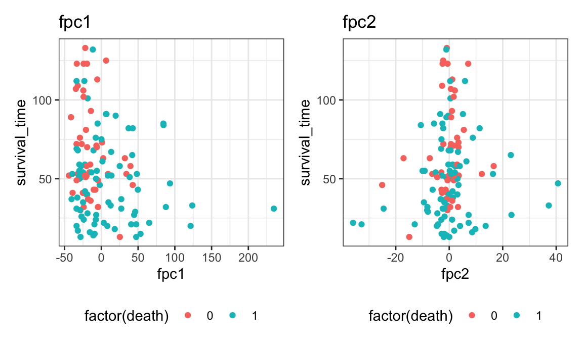
Finally, we’ll model survival as the outcome with fpc scores as covariates.
phmod_fpca = coxph(Surv(survival_time, death) ~ fpc1 + fpc2 + age,
              data = surv_fpca_df)
summary(phmod_fpca)
## Call:
## coxph(formula = Surv(survival_time, death) ~ fpc1 + fpc2 + age,
##     data = surv_fpca_df)
##
##   n= 127, number of events= 80
##
##           coef exp(coef)  se(coef)      z Pr(>|z|)
## fpc1  0.007829  1.007859  0.002526  3.099  0.00194 **
## fpc2 -0.003667  0.996340  0.012310 -0.298  0.76579
## age   0.014329  1.014432  0.011390  1.258  0.20836
## ---
## Signif. codes:  0 '***' 0.001 '**' 0.01 '*' 0.05 '.' 0.1 ' ' 1
##
##      exp(coef) exp(-coef) lower .95 upper .95
## fpc1    1.0079     0.9922    1.0029     1.013
## fpc2    0.9963     1.0037    0.9726     1.021
## age     1.0144     0.9858    0.9920     1.037
##
## Concordance= 0.626  (se = 0.034 )
## Likelihood ratio test= 13.75  on 3 df,   p=0.003
## Wald test            = 17.69  on 3 df,   p=5e-04
## Score (logrank) test = 18.08  on 3 df,   p=4e-04